Aesthetics and composition
In my workshop, we were given the task to compose a minimalistic landscape using one tone of colour.
I approached this task by picking out warm colours such as orange or yellow tones. So then I decided to choose an light orange colour for the sky, a 3 layers in a form of mountains where the tone gets darker and darker in each layer.

The results I got was impressive in terms of how simplistic it was just by using 3 tones of orange to show the contrasts between the layers of mountains and finally ending with a silhouette of a man running across the landscape. I also had composition in mind, balancing the picture with a large mountain peak on the left hand side of the picture and the small man running across to balance the picture in terms of what it shows. Even though the mountain takes up the majority of the picture, the man is in the forefront making it the center of attention as the colour black has a strong contrast to the orange background. This makes an effective picture as it doesn’t look over crowed or in regards in where to look at, making it simplistic.

I later worked on the picture and added a few aesthetics such as trees to further make it visually appealing without over crowding the picture as it is done subtly and without blocking the main points of interest.
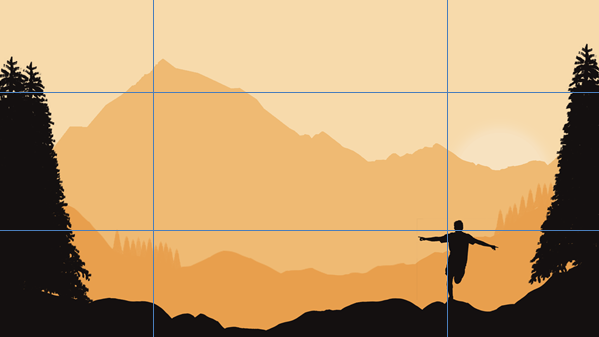
Using the rule of thirds, I deliberately placed the points of interest remotely near where the lines cross. This is because these are areas people look at when faced with a screen or picture starting with the top left corner to the top right then the bottom left to bottom right. As I wanted the man to be the first thing the person to look at first is the reason why I chose a different colour to make it stand out from the mountain.